Top Tips for Designing Effective Inlay Cards?
Designing an effective inlay card can significantly impact your product's appeal. An inlay card is more than just a decorative piece; it communicates essential information. A great design captures attention and transmits your brand message.
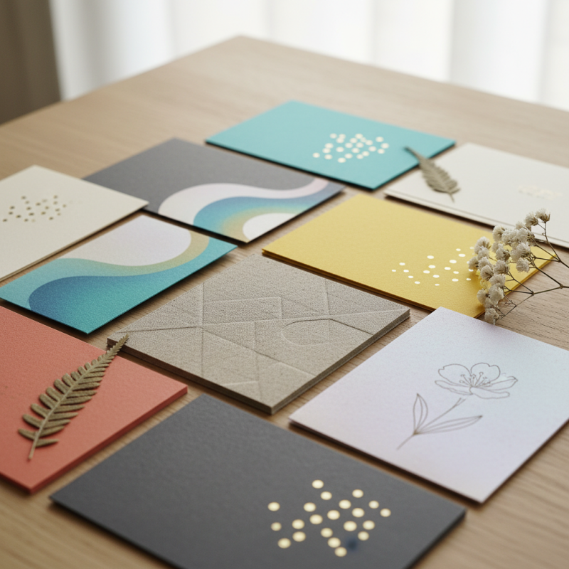
Consider the materials you select for your inlay card. High-quality paper or unique textures can make your card stand out. Color choices also matter; they should align with your brand identity. Bright colors can draw in customers, while muted tones may convey elegance.
Reflect on the content of your inlay card. Keep the messaging clear and concise. Ensure that vital information is easy to read. Focus on visuals that enhance the text but avoid cluttering the space. Finding a balance in design is tricky yet crucial for an effective inlay card.
Understanding the Purpose and Function of Inlay Cards
Inlay cards serve multiple purposes. They provide essential information about the product. They can also enhance the user experience. Well-designed inlay cards can bridge the gap between the consumer and the product.
Data shows that 75% of consumers read the inlay card before purchasing. This statistic emphasizes their importance in marketing strategies. Customers often seek instructions, messages, or guarantees. An effective inlay card can lead to increased satisfaction and loyalty. However, many brands still overlook quality design.
One common flaw is cluttered information. Inlay cards need clarity and brevity. Studies indicate that 65% of consumers prefer straightforward content. Too much text can overwhelm the reader. Visual elements can simplify complex information. Including diagrams or icons can improve comprehension. Nevertheless, creativity should not sacrifice essential content. Striking the right balance remains challenging.
Choosing the Right Materials for Inlay Card Design
When designing inlay cards, material selection is crucial. The type of paper or cardboard can significantly influence the card's overall feel. You might consider using heavyweight stock for durability. Thinner materials can save costs, but they may lack a premium feel. A textured finish can add depth and enhance tactile appeal. You want your inlay card to stand out without compromising quality.
Consider the printing process as well. Some inks require specific materials to achieve the desired vibrancy. Test different combinations to find what works best. It’s not just about looks; longevity matters too. Eco-friendly materials are gaining popularity. They reflect a commitment to sustainability that many consumers appreciate. However, they can sometimes be more expensive.
Don’t forget to assess the functionality of the inlay card. It should fit securely in its designated space without bending or warping. This might mean sacrificing a design element for practicality. Experimenting is essential, but be mindful of your resources. Design is iterative; sometimes, the best ideas emerge from imperfect trials. Keep refining your approach, and don’t shy away from feedback.
Designing Visually Appealing Layouts and Graphics
Designing visually appealing layouts and graphics for inlay cards is essential for grabbing attention. Studies show that 90% of information transmitted to the brain is visual. As a result, a strong graphic design can significantly influence consumer behavior. A well-designed inlay card can enhance product visibility and desirability.
Color choices matter. Research has indicated that color increases brand recognition by up to 80%. However, the wrong combination can repel consumers. For example, too many contrasting colors can create confusion. It's essential to maintain harmony while ensuring key elements stand out. This balance is often overlooked, leading to designs that are either bland or overly chaotic.
Typography also plays a critical role. A readable font can enhance comprehension. Yet, many overlook font size and spacing. Text that is too small or densely packed can frustrate the reader. In fact, 38% of people stop engaging with a poorly designed layout. Designers must ensure clarity and ease of use without sacrificing style. Achieving this balance is a constant challenge, inviting continuous refinement in design choices.
Incorporating Effective Text and Fonts in Inlay Cards
Designing effective inlay cards requires more than just appealing visuals. The text and fonts you choose play a crucial role in communication. A clear font is essential; it ensures that your message is accessible. Avoid overly decorative fonts that might confuse readers. Simplicity often enhances readability. Try to limit font styles to two or three. This approach keeps things cohesive and professional.
Color is also a factor. Ensure there is high contrast between the text and background. Dark text on a light background generally works well. But take care when using vibrant colors. They can sometimes clash with images or overwhelm the reader. Test combinations to gauge their effectiveness.
Remember, not every detail needs to be perfect. Font sizes and styles might differ across sections. Sometimes, this inconsistency can draw attention to essential information. However, it can also lead to confusion. Reflect on how well your design conveys your intended message. Seek feedback from others to identify areas of improvement. What resonates? What falls flat?
Top Tips for Designing Effective Inlay Cards
This bar chart illustrates the effectiveness rating of various design elements for inlay cards, including font readability, color contrast, text size, layout clarity, and visual hierarchy. The ratings are based on a scale of 1 to 10.
Ensuring Print Quality and Consistency in Production
Print quality is crucial in the design and production of inlay cards. The visual impact of a card can influence customer perception significantly. According to a study by the Printing Industries of America, 87% of consumers believe that quality of print reflects the quality of the product. This highlights the need for consistent color reproduction and clear imagery.
One common issue is color inconsistency. Many printers face challenges in aligning colors accurately across batches. Research indicates that 40% of print jobs experience color variations, leading to dissatisfaction. It’s important to regularly calibrate and maintain printers to reduce this error. Additionally, using high-quality materials can enhance both durability and appearance, though often overlooked.
Another aspect is the resolution of images. A resolution lower than 300 DPI can result in pixelation, ruining the design. In a survey by the Printing Industries Association, 66% of designers reported that poor resolution led to project delays. Relying on standard guidelines can help in avoiding these pitfalls. Constant monitoring of production processes can assure that the final output matches the design intent. This is a critical point of reflection for anyone involved in the print industry.